Blog Articles
The Only Landing Page Design We Use To Convert At 30% For High-Ticket And B2B
Most high-ticket landing pages do not fail because of the offer. They fail because they make the visitor work. They bury the form at the bottom, pile on information, and ask people to self-educate when all they wanted was a price. People are busy. Give them a reason to think and they leave.
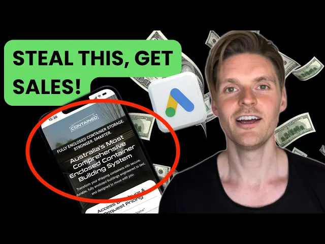
The template below is the one we actually use at Market Lead, built on over $115 million of our own ad spend and refined with our in-house enterprise designer. It is the exact format running for a client right now, Contained Australia, pulling 20 to 30 leads every single day at a conversion rate of over 30%. This works specifically for high-ticket and B2B, because it is engineered to send the best-quality traffic to a page with one clear message and one clear action, so people convert immediately.
1. Win The Hero Section Or Lose The Visitor
Statistics show 80% of people never leave the hero section. That single fact should decide how you build the top of the page. Everything that matters has to live above the fold: a clear headline, a clear sub-headline, the form headline, and the form itself.
Three things we recommend in every hero:
A background image or video that subconsciously communicates what the product or service actually is.
An image or short video under the headline to reinforce the message visually.
One very clear headline. Not clever. Clear.
The visitor arrives from a high-intent Google keyword or a Meta ad in a high-intent state. The job of the hero is to let them read, understand, and act without scrolling. If they have to hunt, you have already lost most of them.
2. Put The Form At The Top, Always
The form is the single most important element on the page, and where you position it matters as much as what it asks. We always put the form at the top. The moment someone lands, they should see exactly what to do and what to fill in.
So many pages force people through paragraphs of content to reach a form at the bottom. Even a button that jumps them down the page is another friction point, and friction kills leads. We already know the traffic is qualified because of the quality of the ads, so the entire goal is to remove every obstacle between landing and submitting.
We have tested this directly. The form at the top produces a higher conversion rate, and a higher sales rate on top of that. More leads because it is visible, and better closing because the intent is clearer.
3. Ask Only The Fields That Qualify
Every field you add lowers your conversion rate. That is statistically consistent, so each question has to earn its place. Name and email are obvious. For B2B and high-ticket, phone number is appropriate too, and most pages wrongly leave it out.
For Contained Australia we kept it deliberately tight:
Location (state, sometimes postcode) so sales knows where the lead sits.
Industry (mining, construction, agriculture, storage, councils and government, other) so we can feed Meta's algorithm data on which industries actually convert.
We deliberately held back the deeper qualifiers, time frame, budget, other intent questions, while the page is fresh and converting at 30%. We will add them over time, and we have told the client to expect the conversion rate to drop when we do. The discipline is balancing the highest conversion rate against the highest-quality lead. A distributor or business owner does not want 100 leads of name and email. They want fewer leads enriched with the data that lets them sell.
4. The One Hack: Use The Word "Submit"
We spent a long time using direct-response button copy like "Access Brochure" and "Request Pricing." Then we tested going back to the traditional "Submit" and conversions went up. With so many direct-response elements already on the page, a plain, almost boring button reads as more professional, and that signals trust.
We rolled it out across other landing pages and saw lifts of 2% to 5%. If you take one thing from this, test the word "Submit" on your button and watch what happens.
5. Design For Trust, And Build For Mobile
The page converts at over 30% because of details hidden in plain sight, not because it looks fancy. A few that move the needle:
Whited-out, isolated product images on a clean background. They look far more luxurious and premium, the same trick high-end e-commerce and skincare brands use. Most B2B and high-ticket competitors run ugly pages, so simply elevating the look positions you above them.
A persistent, sticky call-to-action button so that whenever the visitor has seen enough, the action is right there. No scrolling back up.
Centered text on mobile. 80% of traffic comes from mobile, and left-aligned text that works on desktop becomes hard to read on a phone. Centered text keeps the mobile experience clean and aligned.
Below the hero you can still serve the researchers: benefits with green ticks, use cases, industries, examples, and an FAQ. Let them dig if they want to. Just never make the action depend on it.
The Bottom Line
A 30% landing page is not a design accident. It is a sequence of deliberate decisions. Win the hero section. Put the form at the top. Ask only the fields that qualify. Use the word "Submit." Keep the imagery clean and the mobile experience centered.
Do this and you make the prospect's life easy: a page that is clear on what you do and clear on what they need to do. Do the opposite and you will keep paying for high-intent traffic, then losing it to friction you built yourself. The whole game is removing reasons to leave before they have a reason to act.